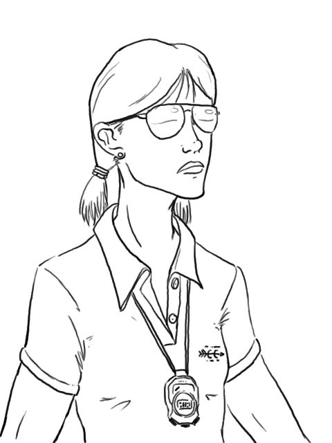
You're doing OK, but here's what's missing, and why some of the proportions seem off. Pretty much from what I can tell you're drawing the outline of the picture and trying to get that shape as exact as possible instead of using fundamental structures and proportions to learn why the characters eyes are where they are and whatnot, essentially drawing to the style, the fluffy outer layer of a drawing, rather than drawing to the solid core mechanics of constructing an image that then has a specific style.
Edit: So I did a drawing to show an example. It's not a copy, just a quick digital sketch of an OC.
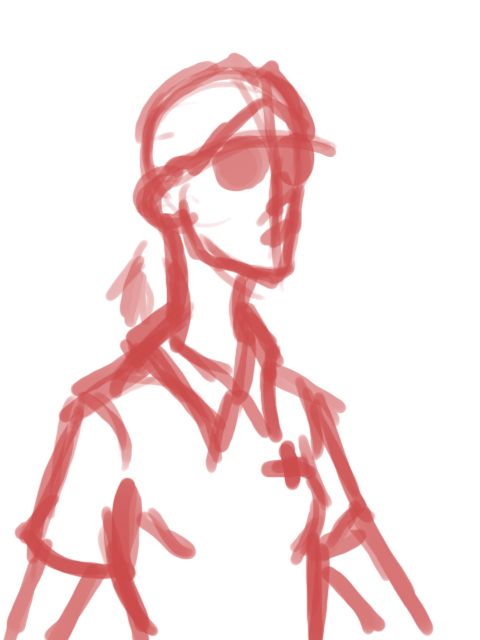
First a rough sketch, or a gesture to get the general space I'm using and overall pose in mind. You'll notice a line down the face, thats a a structure line, keeps things centered and acts as a reference for placing everything like eyes and nose. If you're drawing with a pencil you can draw this really lightly and loosely using almost no pressure, just so you have a general idea of where everything is and how it's going to fit on the page.

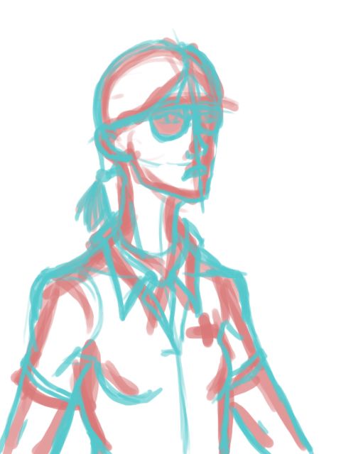
Next I run over it figuring out the centerline of the body and reiterating the one on the face, also establishing where the eyes are so I place the glasses right and working out the shirt, and more importantly the body under the shirt. Everything is drawn off of simple 3d shapes, mostly a whole bunch of cylinders. Again this would be drawn lightly off the computer, just so you've got the basic shapes worked out.

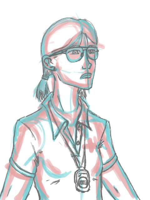
Next I draw the actual picture in detail. With a pencil this is where we start drawing a little darker, working on detail -etc. Now I've got folds and have pulled up references for the Ray-Ban's and Stopwatch to look at. I'm working out hair, eyes and the actual expression here. I'm still reiterating some of my structure lines here and adding a few more, like the ball of the nose.

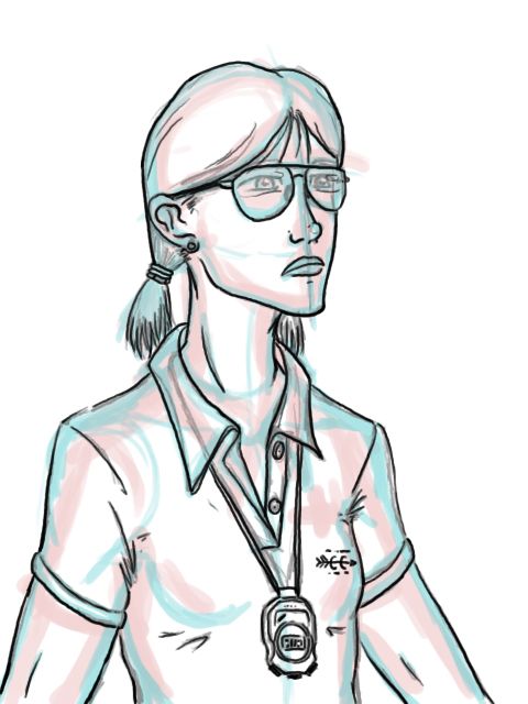
Last step... Inking. This is where we choose the final lines to keep. Sometimes this is done with just pencil lines, picking the favorite lines and darkening them up, sometimes we're actually pulling out a new tool, like an ink pen to finalize the image. Either way this step is pretty much picking what the viewer will actually see.

Final step. Cleanup. Depending on style and tools this could mean a light erasing, just to hide structure lines, all the way down to.. well what I did since I had the luxury of a digital drawing, totally removing the under-structure and leaving the ink to stand alone.

Those are basically the steps most artists go through on a drawing, though some will combine the second and third step particularly when they have the grasp of the forms they're working with really well set in their heads. When you copy a picture I'd suggest going through the same steps, try to capture the gesture of the drawing, then generate the structure to match, including lines to ensure everything lines up, followed by details, and finalizing the drawing.
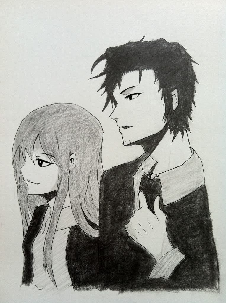
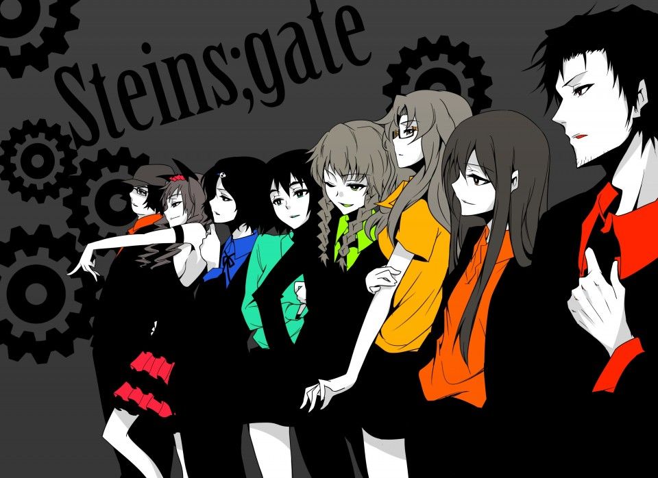
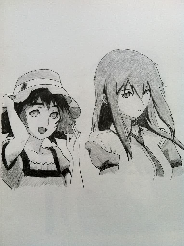
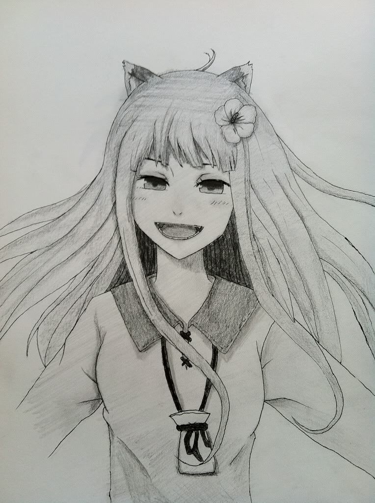
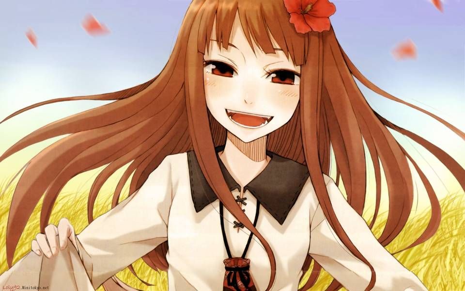
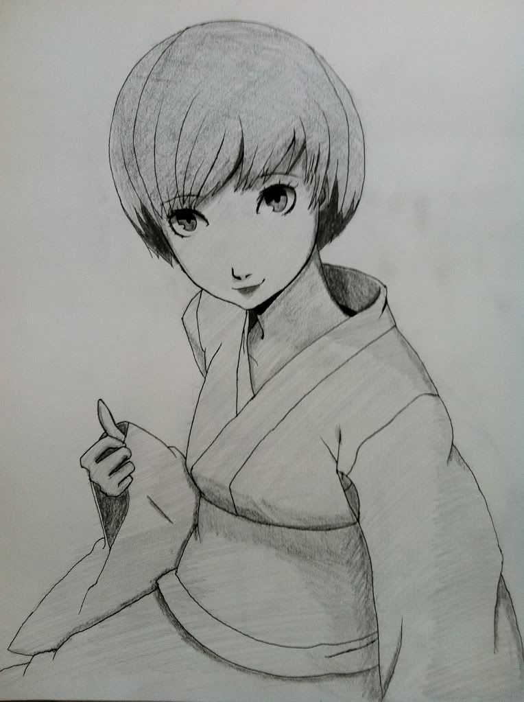
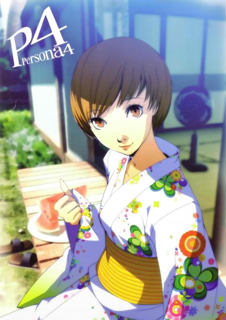
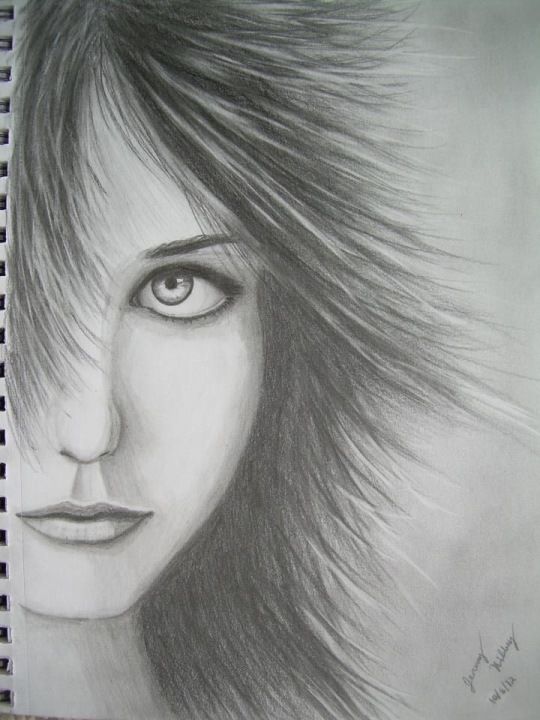


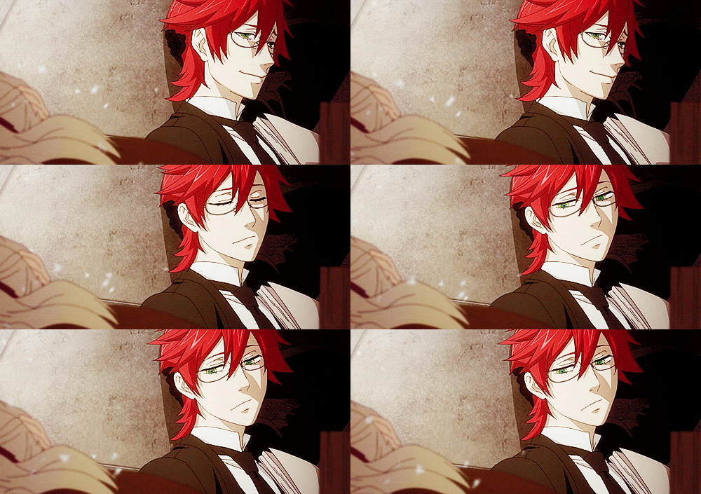
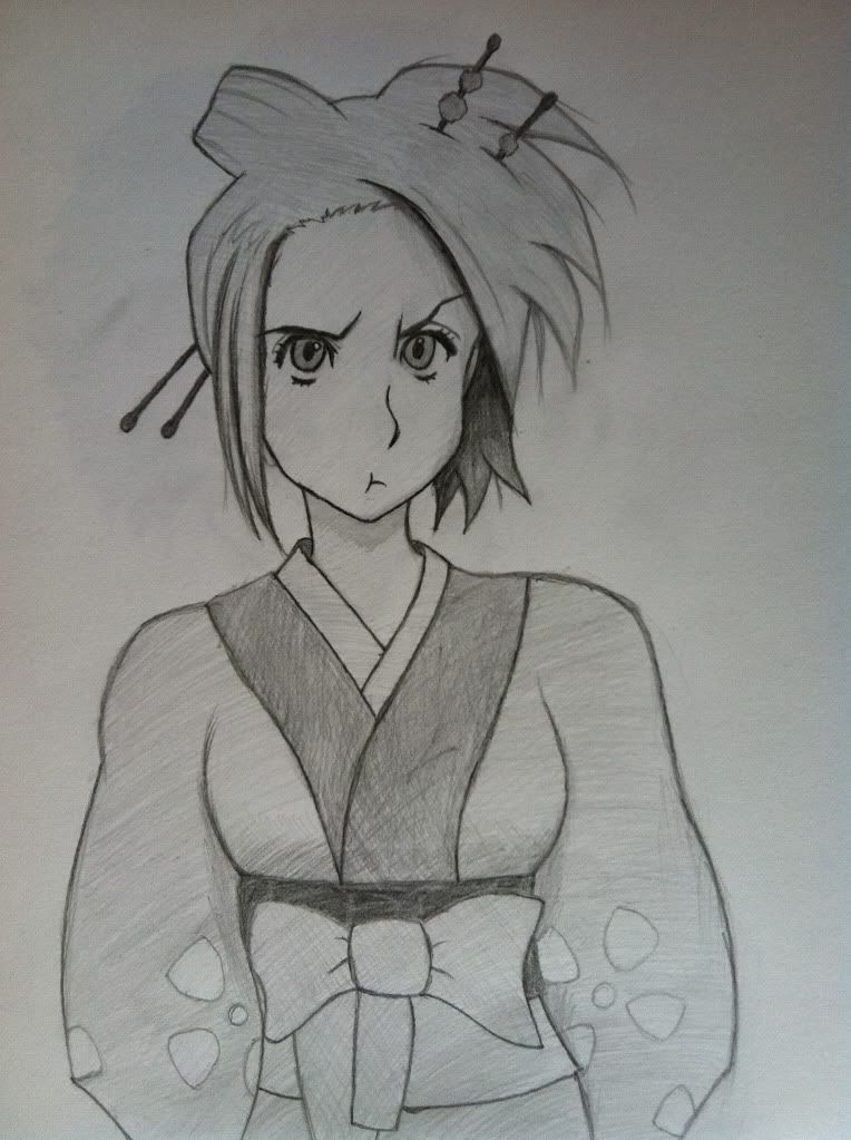
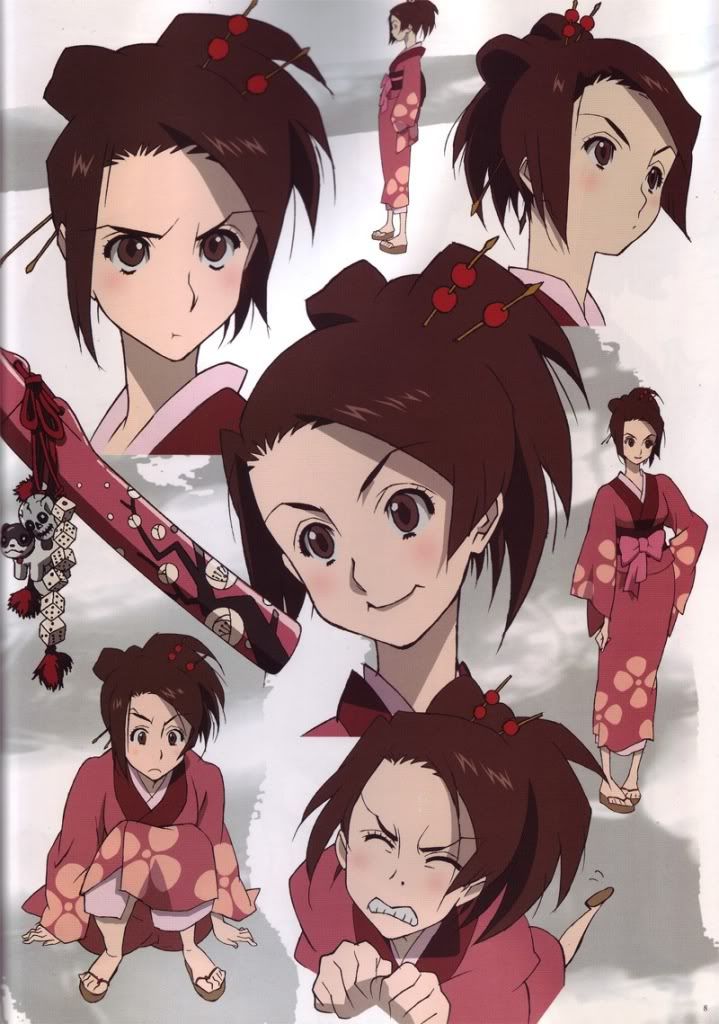
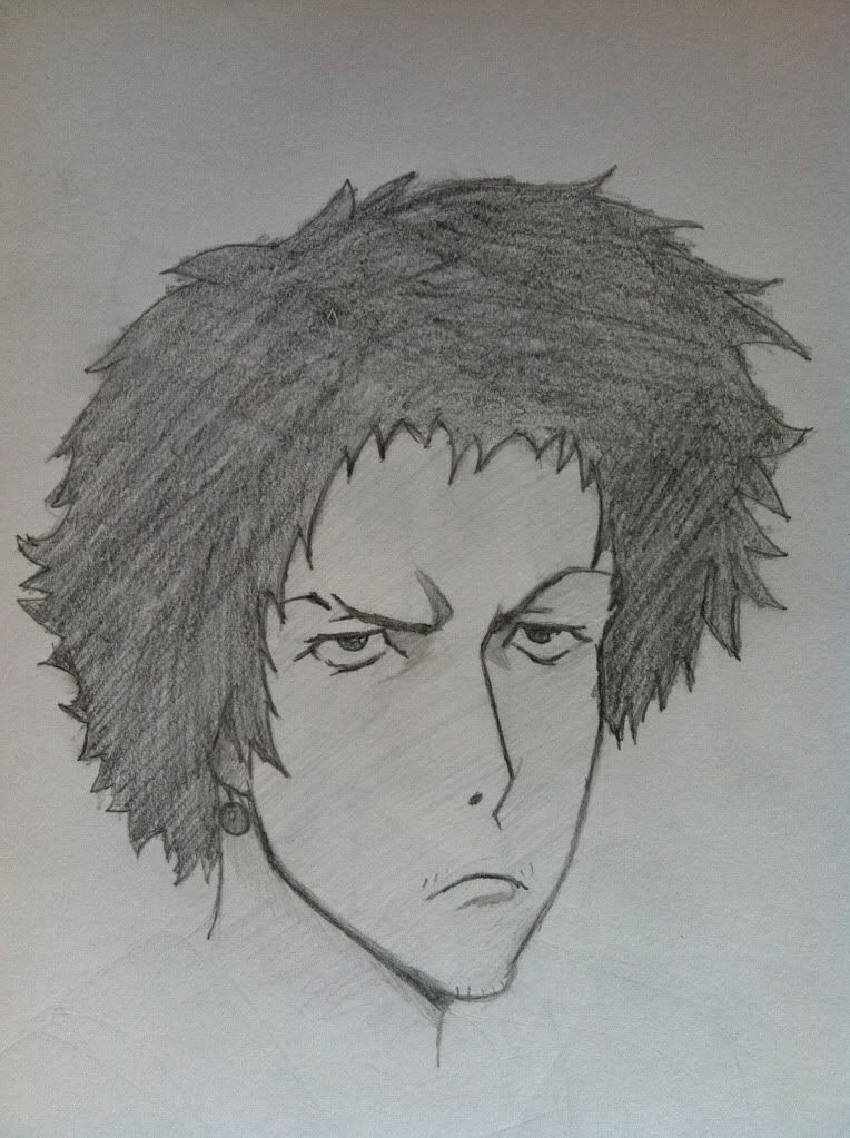
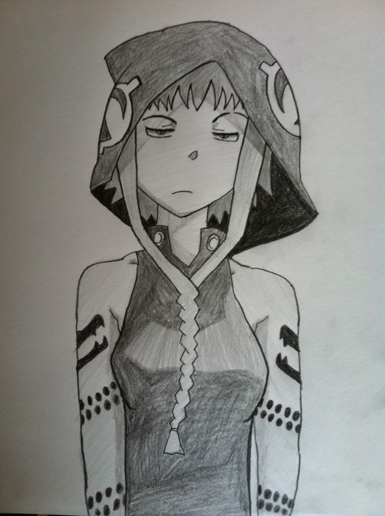
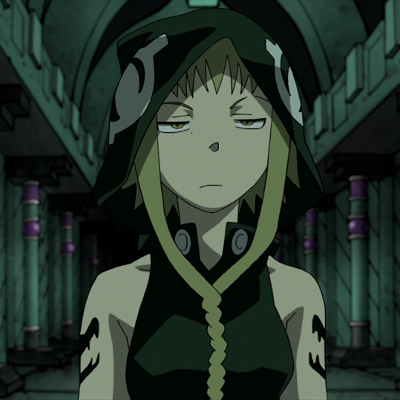

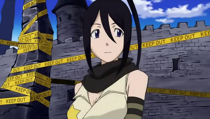
 yea i see what you mean ill have to be careful when i draw shoulders next time lol. And yea i figured id try drawing someone from soul eater after watching it. Lol
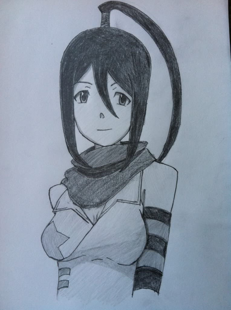
 I really look forward to seeing more of them!